These thoughts about plotting were largely inspired by Guillaume Rousselet’s blog.
Let’s start with this combined scatter ERP/ERF plot:
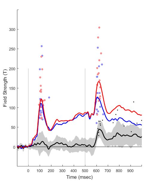
These are real data from an early paper of mine, picked for convenience. The blue and red lines are the signal recorded by a set of temporal MEG sensors, to a tone click played twice (under two different conditions, called Blue and Red here). Tone onset is represented by the two vertical lines. Statistically, Blue and Red diverge at around 100 milliseconds after the second tone, and continue to be different until the end of the epoch. The black line is their difference wave (Red minus Blue). I will explain the rest below.
When I published that paper, I plotted what the majority of ERP/ERF papers have: the red and blue lines, with an indication of stimulus onset and the time window of statistical significance – and little else. The problem with such a representation is that the mean (the blue and red lines represent mean activity over subjects), while being a useful summary measure, might or might not be strongly representative of the data. In fact the mean and the variance together sometimes stem from quite different underlying distributions (click on any of the images below for source).
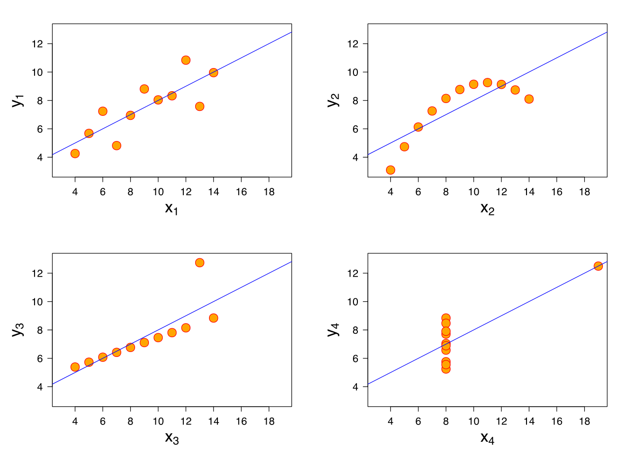
Not only do the mean and variance here – identical in all four plots – come from different distributions, but if we performed four standard parametric t-tests on these data, contrasting x vs. y values, we would get identical results.
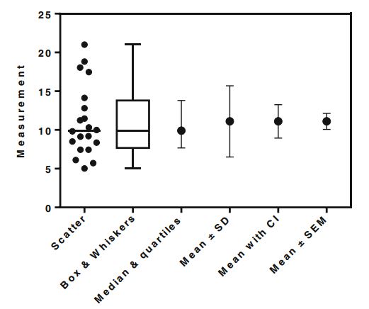
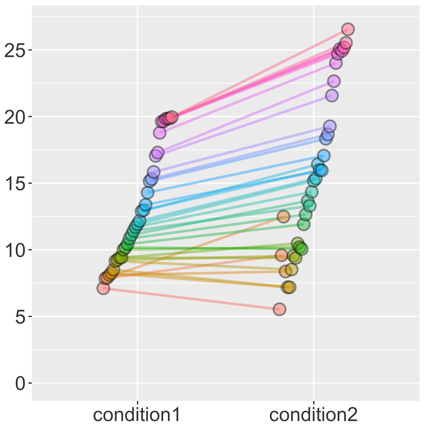
This is why people are moving away from representing data using bar plots, where the variability in the data is hidden behind a slab of bar, to representations that include this variability. My favourite is the leftmost one here, the 1D scatterplot:
In similar vein, the data of two conditions can be represented side by side in such 1D scatterplots, and if they come from a within-subjects design, can be connected by a line from one to the other, showing both the direction and the consistency of the effect:
With 2D data, such as time series (signal strength x time), things quickly get more complicated. A variety of measures can be represented here, each of them useful.
We could, for example, plot all the single subject lines for the Red and Blue conditions. We could also (or alternatively) represent some measure of dispersion around each of these lines – variance, standard error of measurement, confidence intervals, etc.
We could plot a mean difference wave, individual difference waves, and a measure of dispersion of the difference wave, as well as what proportion of subjects show a difference in a certain direction in a given point in time.
Then there is the figure legend, axis labels, an indication of important moments in the epoch (such as stimulus onset), an indication of the statistically significant portions of the data, perhaps with levels of significance. And maybe those individual waves can be individually colour-coded so as to denote the shape of the effect. All of this is useful, but maybe it’s too much?
The problem is that good figures, like good writing, have to tell a straightforward story.
The figure needs to have a clear message which can be grasped quickly: as quickly as when you look up from your smartphone during someone’s talk, or slowing down as you walk by someone’s poster. When you take a second glance more of the details should become evident. Once you’re drawn in, you can take the time to work out some of the remaining complexity. Reducing dimensionality of the represented data is just as important as showing its intricacies.
Getting back to my scatter-ERP/ERF plot, here is what I decided to include and exclude:
A difference wave. Although formally redundant once the means of the two conditions have been plotted (the red and blue lines), their difference over time (the black line) is hard to visualize and should be included for the reader’s convenience.
Summary measures of dispersion for the individual conditions. These make very little sense to me in a within-subjects context, so I did not include them. Variability in signal strength in M/EEG is largely a function of distance of brain to the sensors, or amount of gel, impedance of the reference electrode, anatomical differences in cortical folding or exact location of critical brain regions. This is rarely relevant to our theoretical questions. If the comparison is between groups of people who might be expected to differ in these respects (like patients vs. healthy controls, or younger vs. older children), then including them as a sanity check is a good idea; otherwise I would leave them out of the figure.
A measure of dispersion for the difference wave. Here, a measure of dispersion does tell me something about the consistency of my within-subject effect across people. I went for standard deviation, because, frankly, it and variance are the only dispersion measures I feel I have a good intuitive grasp on. And this is only because I spent a year studying psychology of individual differences, which is essentially a detailed journey through variance. I haven’t got a clue what a typical cognitive psychologist gets out of seeing a confidence interval, for example.
Individual subject data. Individual subject lines are incredibly useful, but their drawback is that they add clutter. This is why I decided to reduce them to two scatter plots, at two different time points. I picked a time interval around the auditory N1 component (that big peak about 100 ms after tone onset), and plotted, for each subject and condition, a dot to denote at which latency this component reached its maximum, and also how high this peak was. What I can see is that the second tone leads to a wider distribution both in terms of timing and in terms of amplitude, and that the significance of the difference between Blue and Red largely stems from the blue condition clustering fairly low on amplitude in some subjects. For the difference wave I did something similar, except that I looked for the peak difference in conditions across the entire epoch following the second tone (500-1000 ms after the first tone).
Time window of statistical significance. Usually I would indicate it somehow but in this case it is bloody obvious so I left it out. Perhaps less obvious is that there is no statistical difference in the first part of the epoch, but I let the principle of uncluttering win.
Here are the advantages I see of such a combined scatter and ERP/ERF plot:
- Individual data are included but clutter is removed.
- The individual data represented in the figure cluster in time around cognitively and physiologically meaningful periods in stimulus processing.
- The effect of potentially different latency spread on amplitude across conditions is shown.
- Theoretically less meaningful measures of dispersion are removed.
And the disadvantages:
- It is not clear which pairs of red-blue dots belong to the same person. I would prefer to plot this in a separate figure rather than indicating it on this one.
- Looking for individual peak latencies requires clearly peaked components, which is not always what we have in the data. For example, in the difference wave maxima here (the black dots) there is a trade-off between looking for the point in time where the effect is strongest, and gaining an insight into the distribution around a smaller, theoretically more meaningful time window.
This approach can also be applied to time-frequency data, once collapsed across a frequency band and plotted as power over time. I didn’t include a legend in the figure because I usually do that only after exporting from Matlab.
The data for this plot can be found here, and the (matlab) code here. Is this a reasonable way to represent time series data? Let me know what you think!